DRAFT - BeachCOMBERS - Effort Based Beach Cast Surveys
20 Years of Data
About this document
CeNCOOS (Central and Northern California Ocean Observing System) working with the BeachCOMBERS program, aggregated beach cast surveys of marine mammals and seabirds from BeachCOMBERS, Beach Watch, and the Marine Mammal Stranding Program at Humboldt State University. These data, when combined cover surveys from Del Norte County down to Los Angeles County for over 25 years.
These data have been made available in the (Caloos) CeNCOOS Data Portal [data.caloos.org], which in addition to the COMBERS data, is jam packed with other marine data including data from moorings, satellite, R.O.V surveys, and oceanographic and atmospheric models.
Here, we are going to walk through some of the tools in the portal and access some of the COMBERS data that many of you have helped collect.
Note: If you get lost or want to skip a head, there are links to the portal along the way
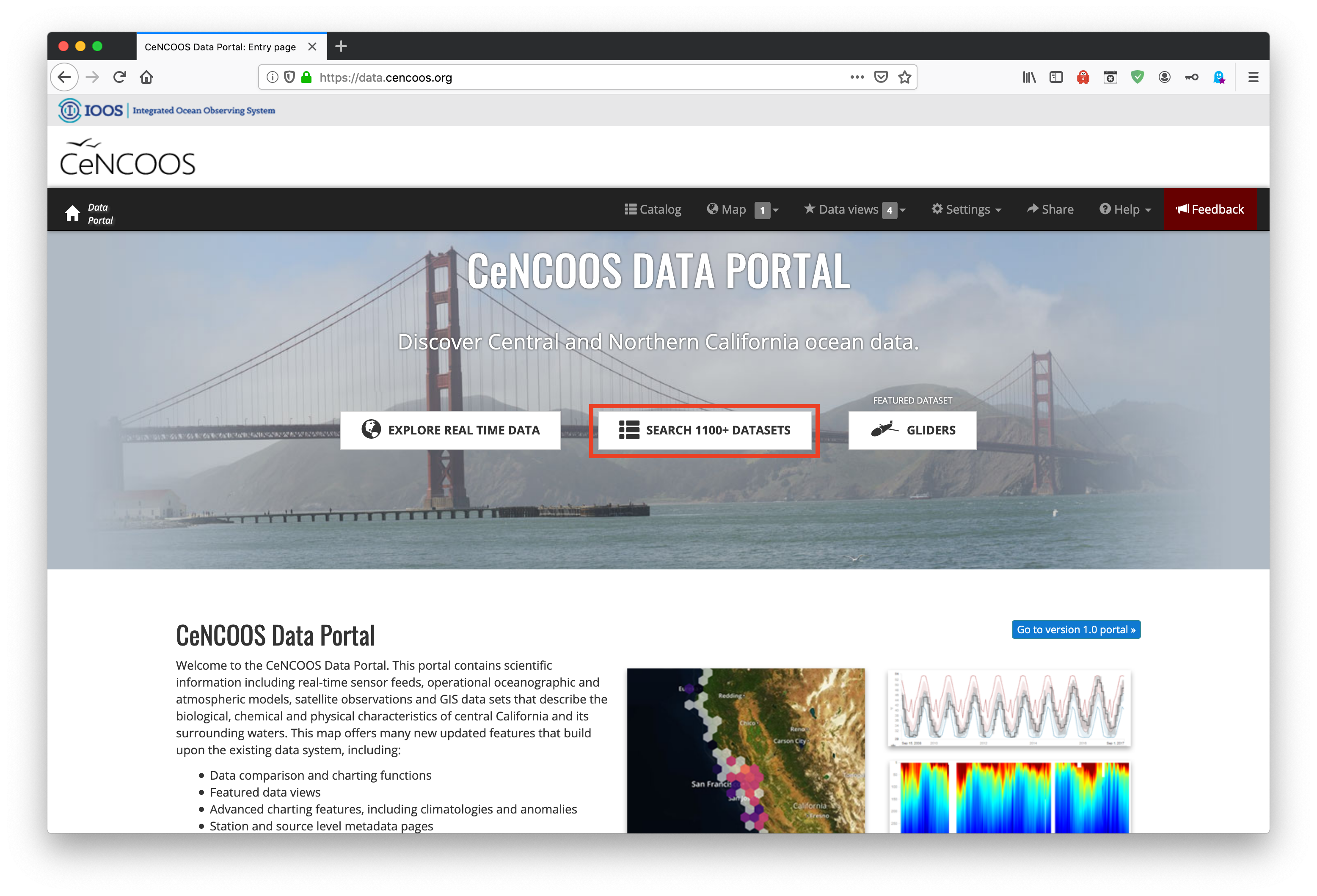
1) Open the Data Portal
Note: The data portal works best using the Firefox and Chrome web browsers
The CeNCOOS Data Portal can be accessed by going to data.caloos.org.
The portal has three main components:
- The
Map Layer - The
Data Catalog(which can also be accessed in theMap Layer - The
Glider Visualizer(which we are not going to cover today)
To get to the Catalog Layer click on the Search 1000+ Datasets button
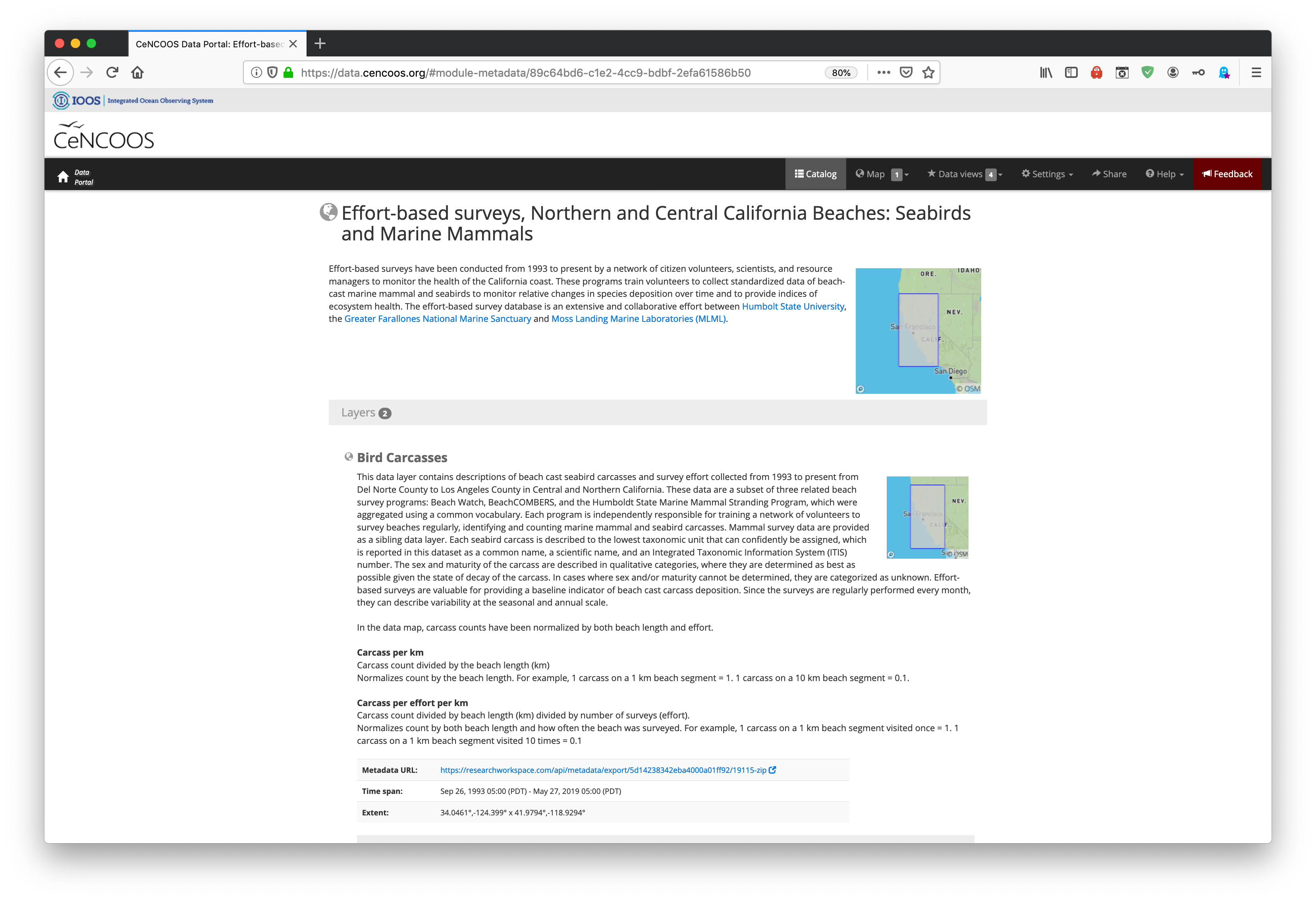
Now lets search for the BeachCOMBERS data. This is part of the Data Layer named Effort-based surveys, Northern and Central California Beaches: Seabirds and Marine Mammals, but the Data Catalog is pretty smart and each dataset includes a set of tags that are used to classify different types of data.
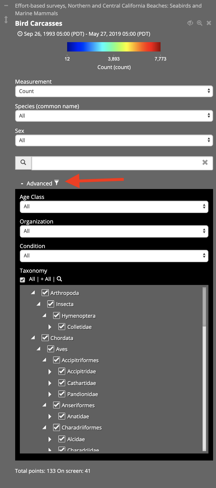
Note: There are many advanced ways to filter queries in the Data Catalog that we won't be covering here, but can be accessed by selecting the Advanced button underneath the search bar
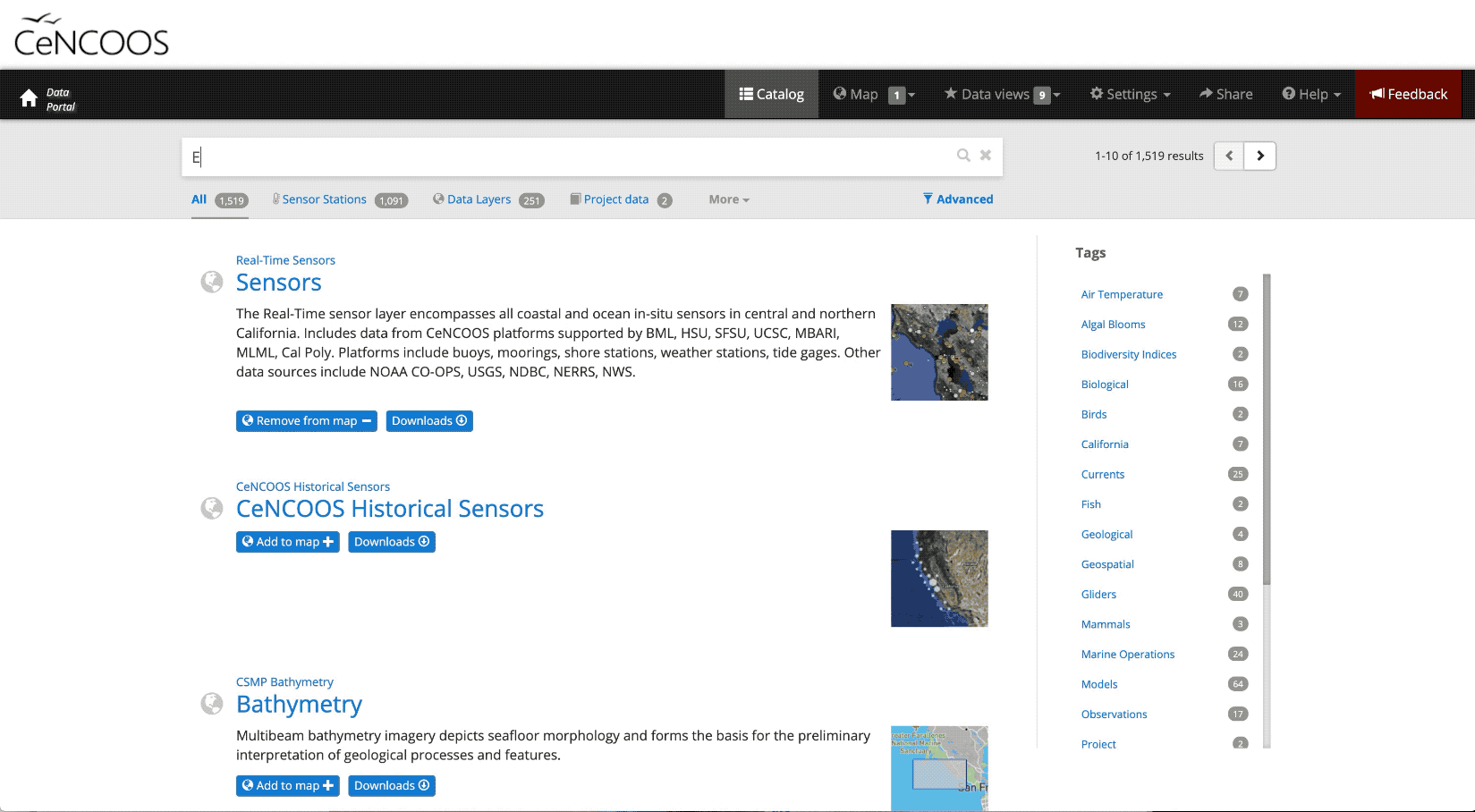
Once we find the dataset we want, we can add it to the Map Layer by selecting the Layers button and then the Add to map button.
Here we also can read a narrative about the dataset, which includes a description of how different metrics are calculated as well as a link to the ISO metadata record for those who want to dive deeper.
Navigating the Map Layer (Click on the Map Button)
Here we can visualize many types of data both spatially and temporally.
Each different dataset is called a Layer.
By default the real-time sensors data layer will be displayed
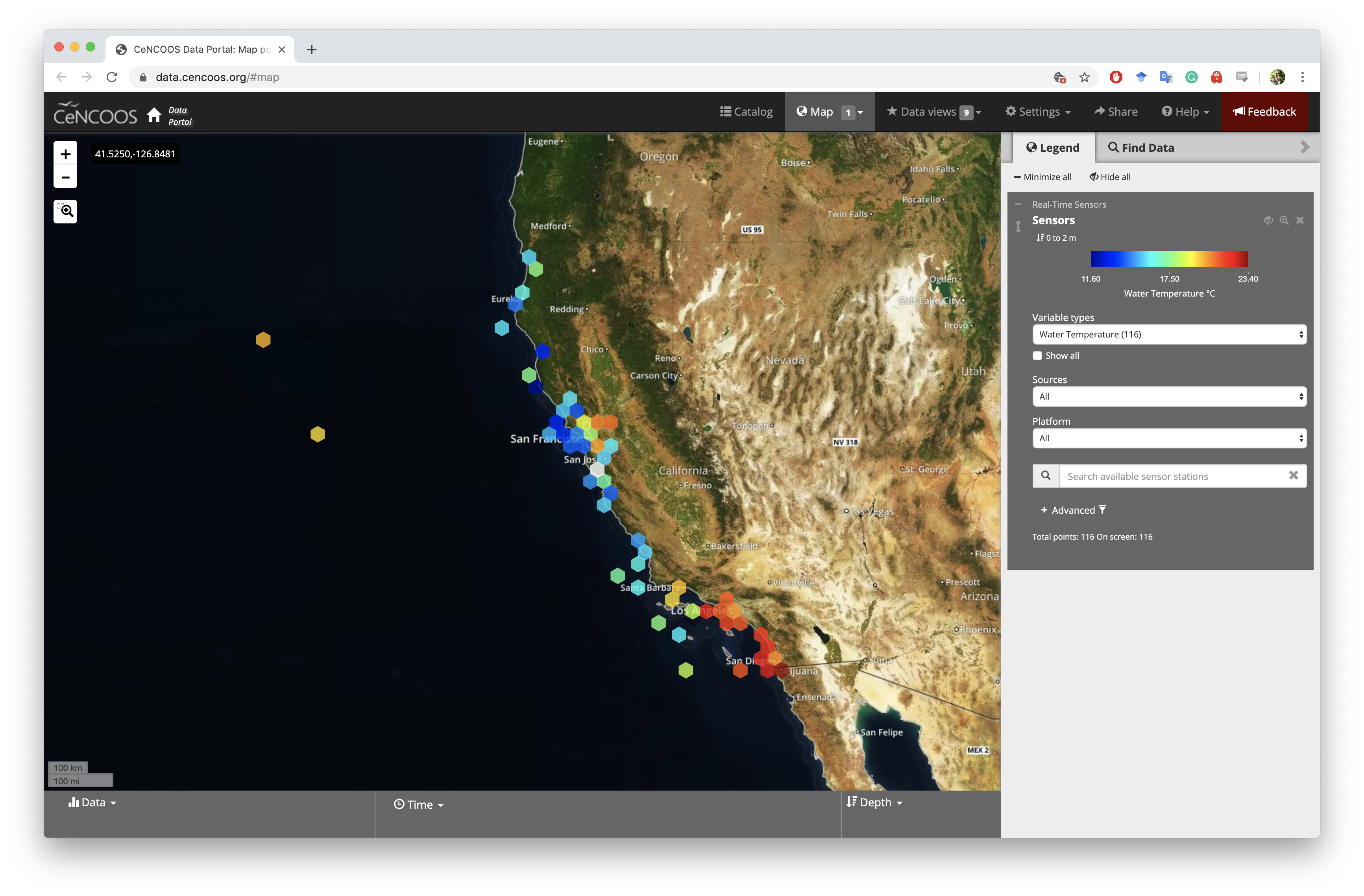
There is a lot going on here! Lets focus on the black Navigation Header at the top of the portal.
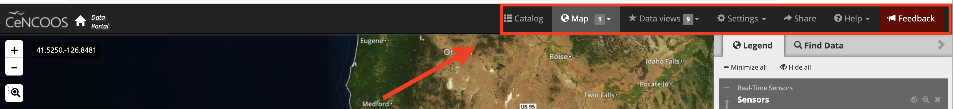
There are 7 Tabs here:
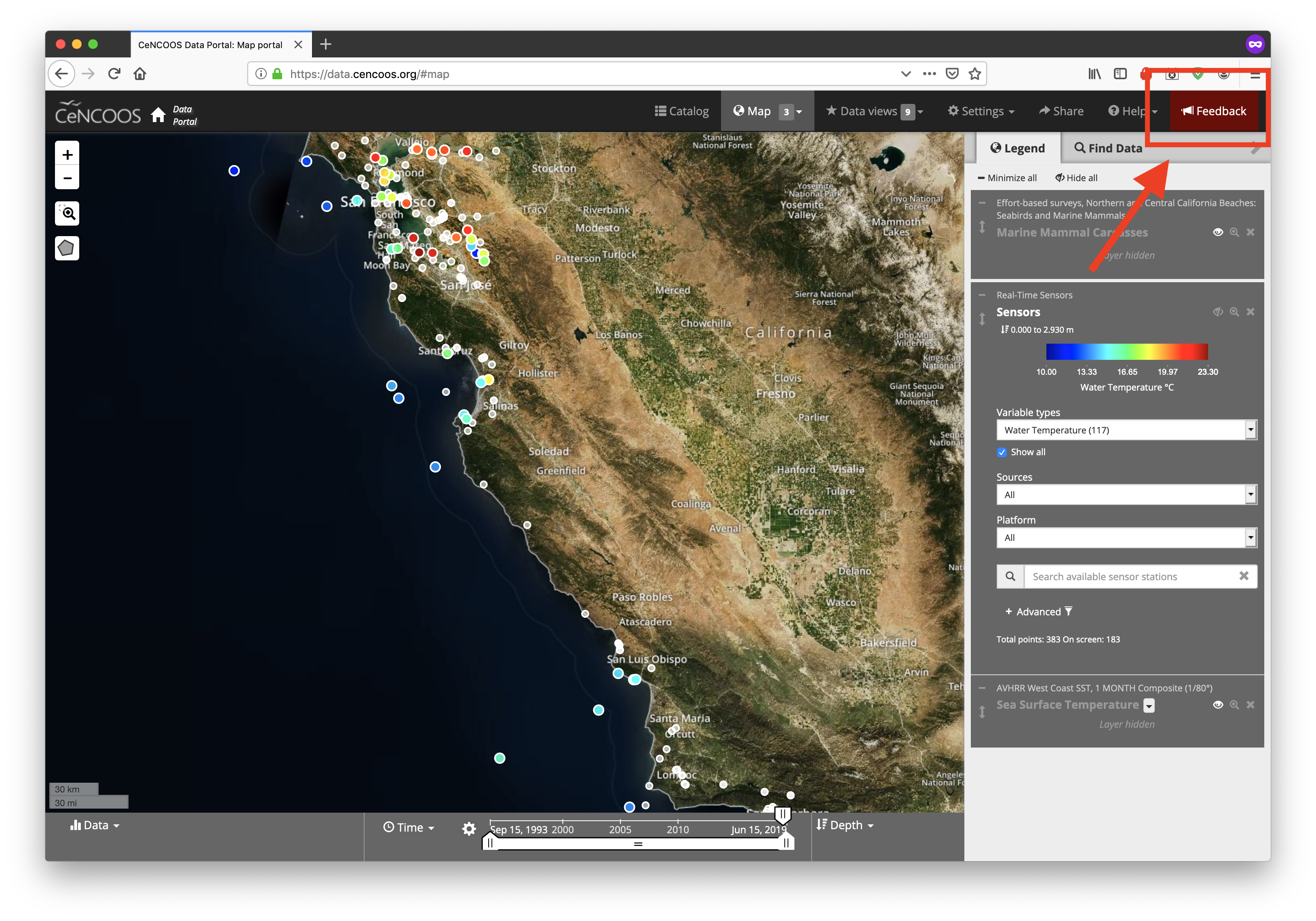
Catalog- This takes us to the Data CatalogMap Layers- This will take us to the Catalog entry for a loaded data layerData Views- These are collections on plots from different Data Layers (we'll come back to this soon)Settings- Here you can change things like the Units and color schemesShare- This will generate a unique link to what you are currently seeing in the portal. This can be shared with others or used to regenerate the portal in its current state.Help- Here you find links to the help documents and an interactive guide to the portalFeedback- This is a great way to report bugs, ask questions, or open a line of communication with us! We track all of the feedback and appreciate any comments.
Exploring the Data
Now lets go back to the Map Layer by clicking on Map button.
It looks very busy, so lets go over how to use the Map Layer
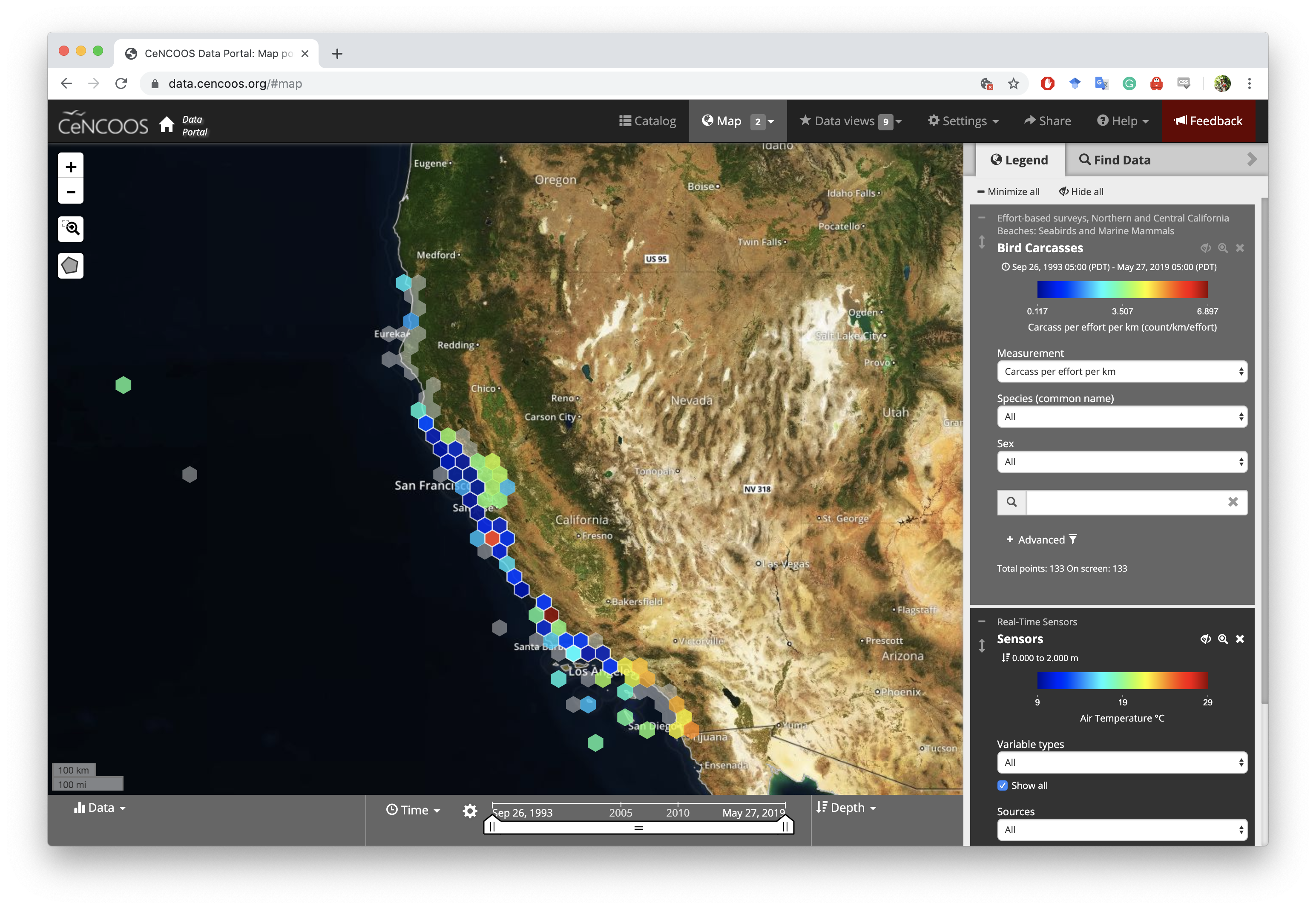
Currently, we have two data Layers loaded up. First the Seabird Carcass layer and the Real-Time Sensor layer, which is loaded by default (See Appendix for how to use this layer).
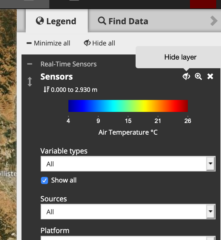
In the mean time, lets hide this layer.
Under the Legend tab select the eyeball icon with a slash next to the title of the layer. Selecting this this again will re-enable the layer.
Zooming into Monterey Bay
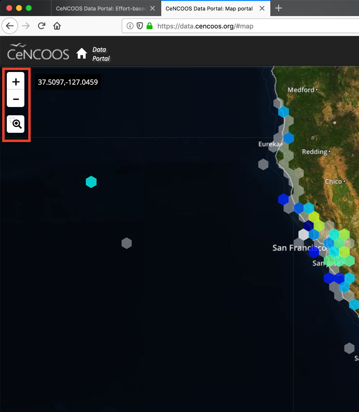
Zooming in the portal can be accomplished a couple of different ways:
The Plus and Minus ButtonsThe Magnification Tool: Drag a rectangle over the region that you want to zoom to.Zoom in/out with a scroll wheel or by double clicking on a region
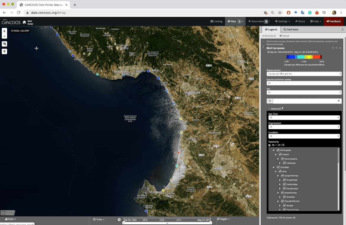
Now that that is done, we should only be able to see Seabird Carcass surveys. Each color corresponds to a survey site.
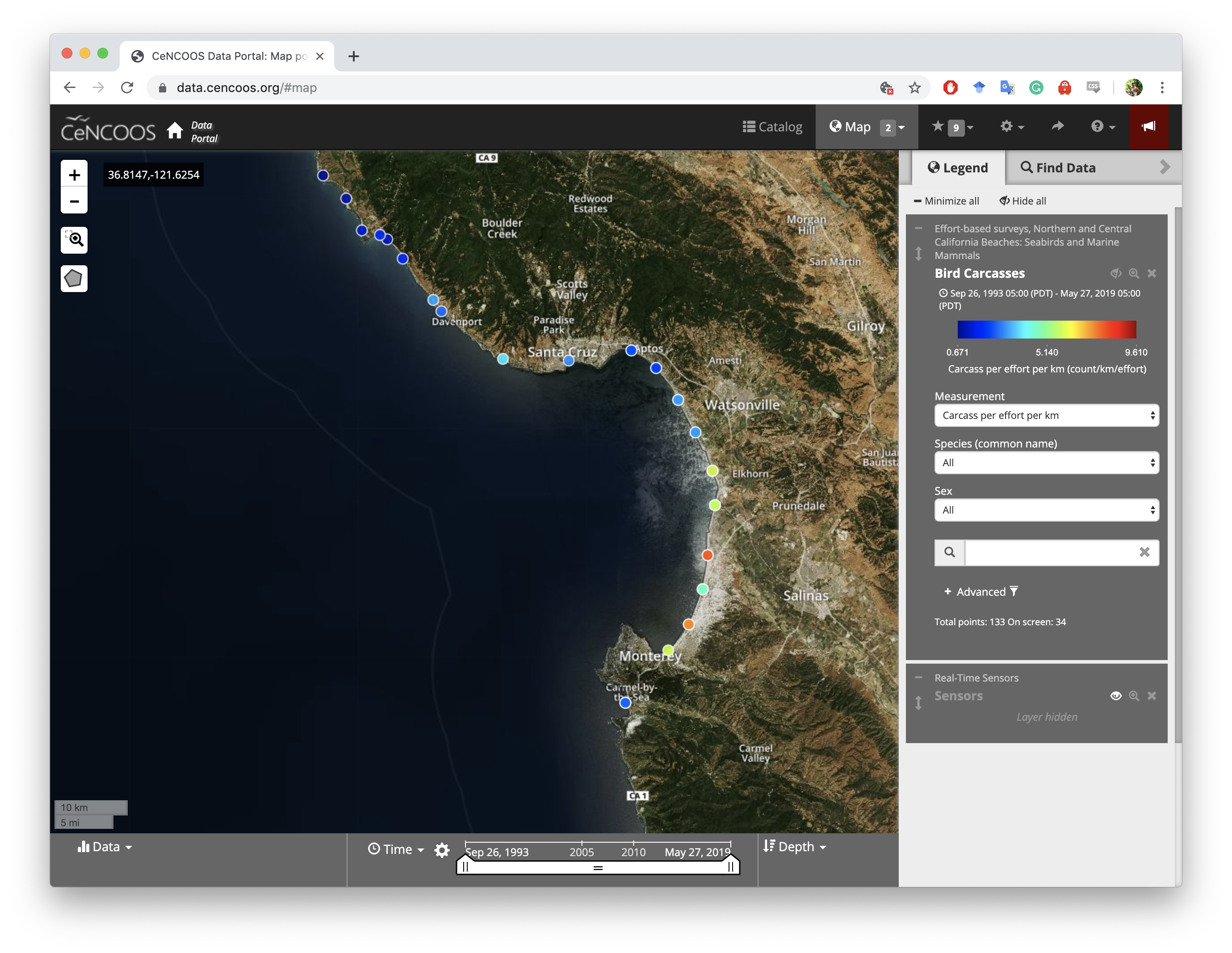
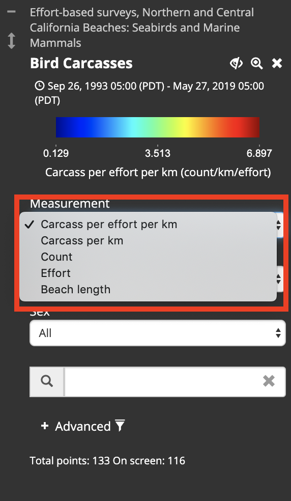
Let change the default measurement to display the Counts instead of Carcasses per effort per km . Click on the Measurement drop down menu in the Legend and select Counts
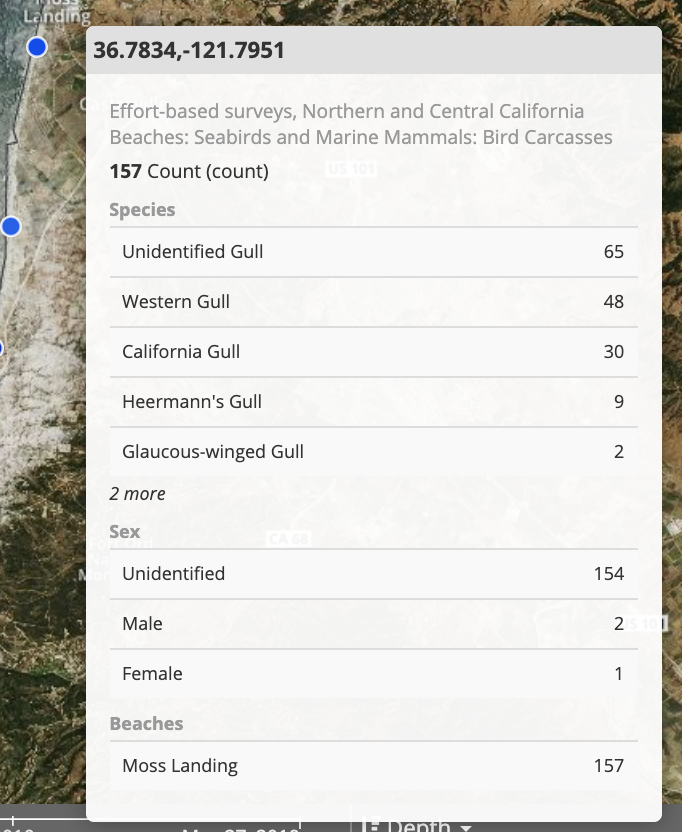
Now hover the mouse over a site and see what happens.
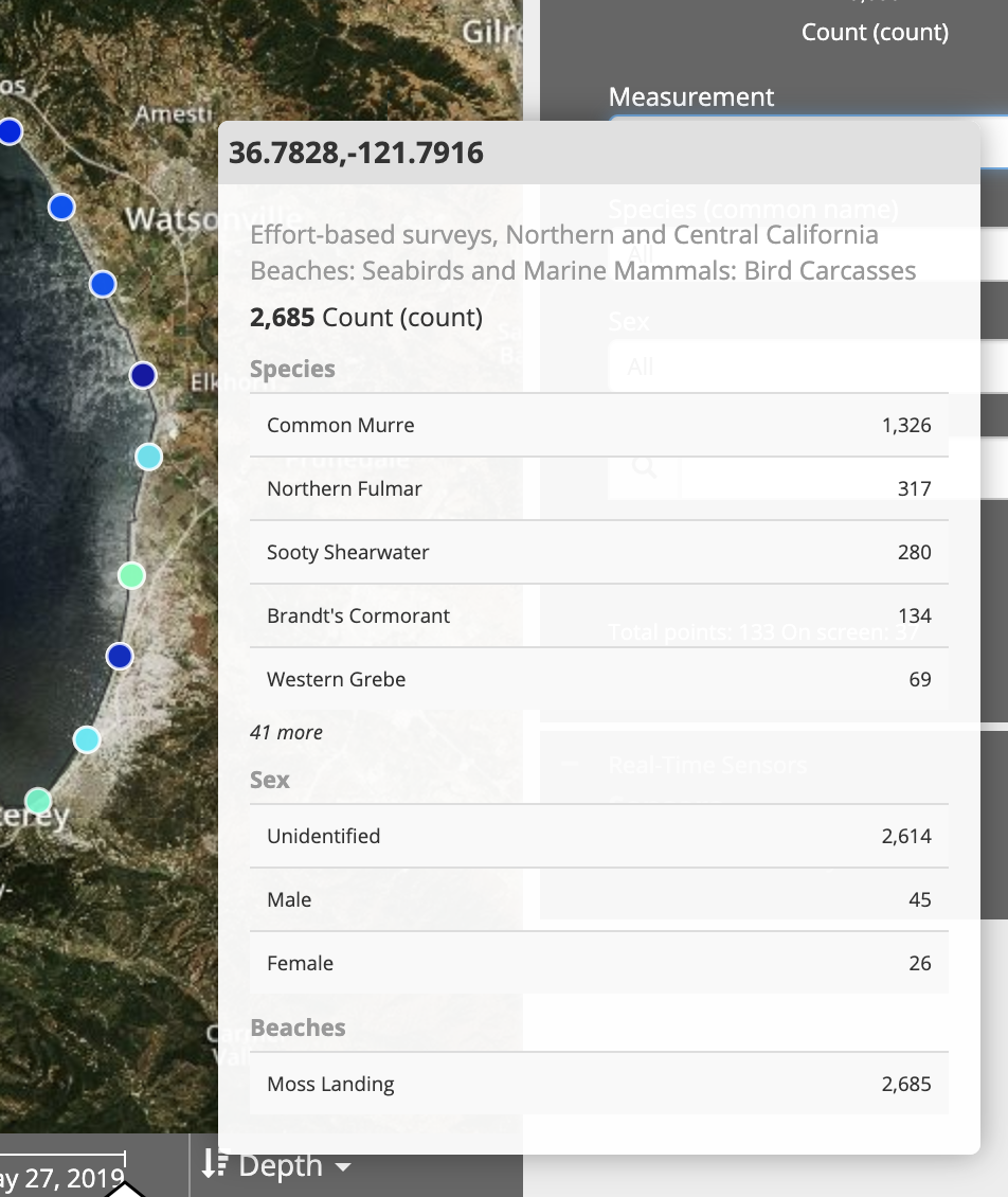
This is a sum off all of the most common Seabird Carcasses that has been found at this beach, as well as some metadata about the beach.
We can also click on a site to see the time series of that site. Try it out!! -->
Filtering Data
The portal has multiple ways to filter data: by time, by taxonomy, by collection group and more.
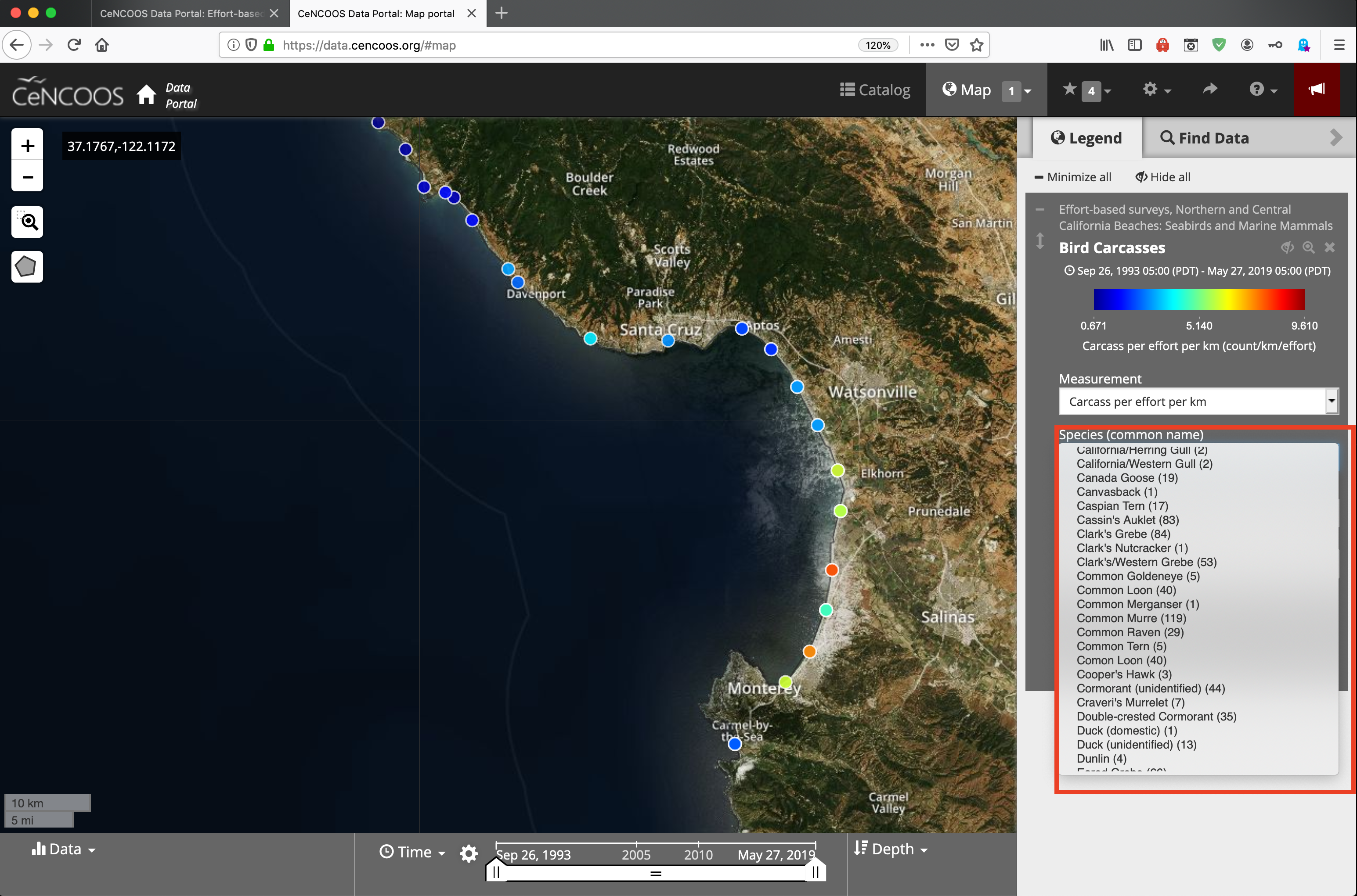
In the Legend box select plus sign on the Species (common name) drop-down menus. This will give a list of the common names of different birds that were identified.
For more information about filtering by taxomnomy and organization see Appendix: Advanced Filtering
Keyord Filtering
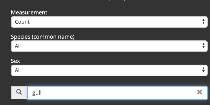
There are some other really cool filtering feature, try selecting a Species using the common name.
You can also use keywords to filter the data, try searching for "gull"
Now when you hover over a site you can see that multiple species of gulls are included in the filter.
Now lets look at some specific mortality events and then include some environmental data from satellites.
Using what the tools we just showed:
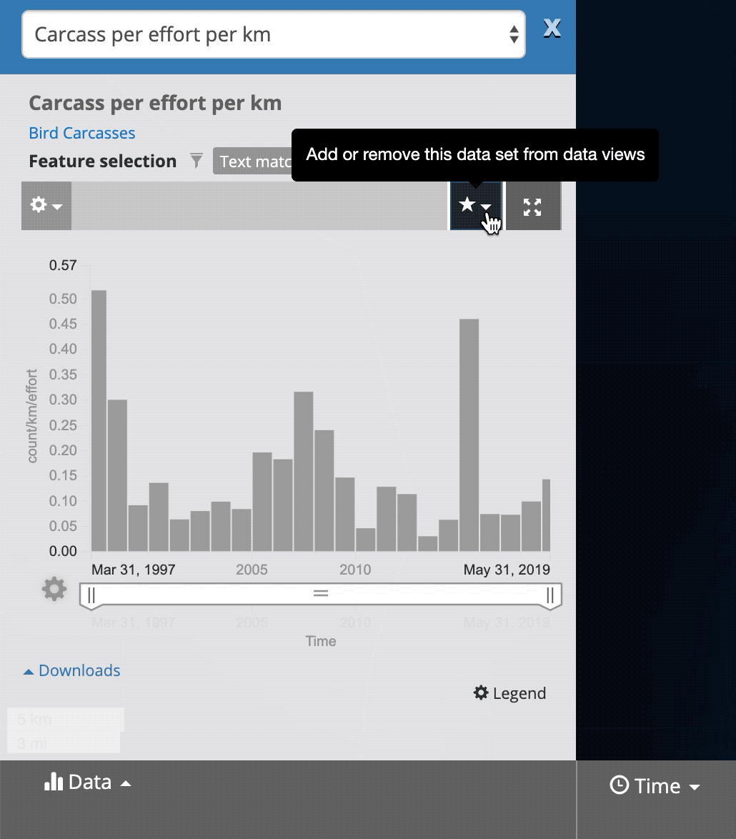
- Filter the data to just select
Common Murre - Use the
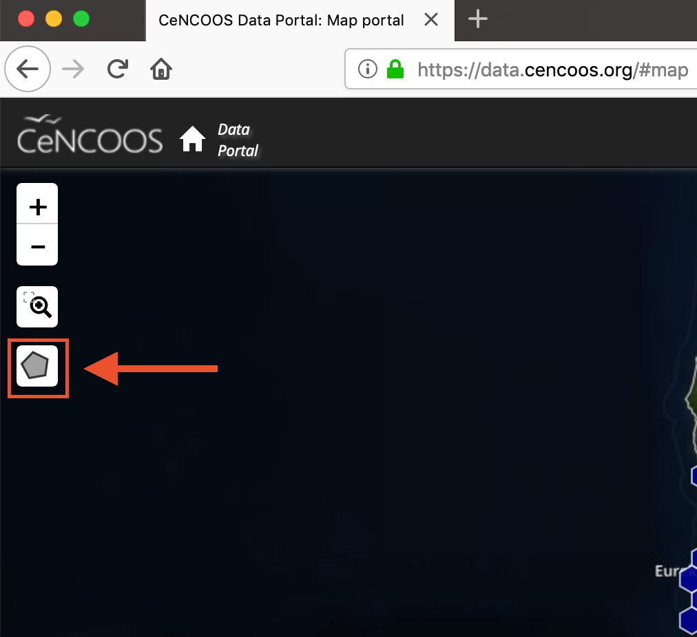
polygon selectiontool to select the beaches around Monterey Bay - Select the
Carcasses Per KmMeasurement
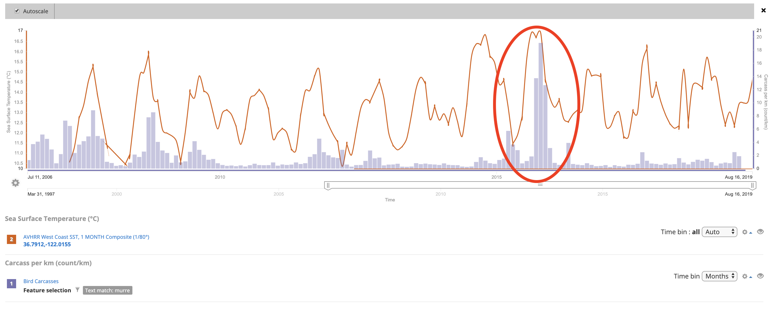
The results should be a time series plot that looks similar to this:
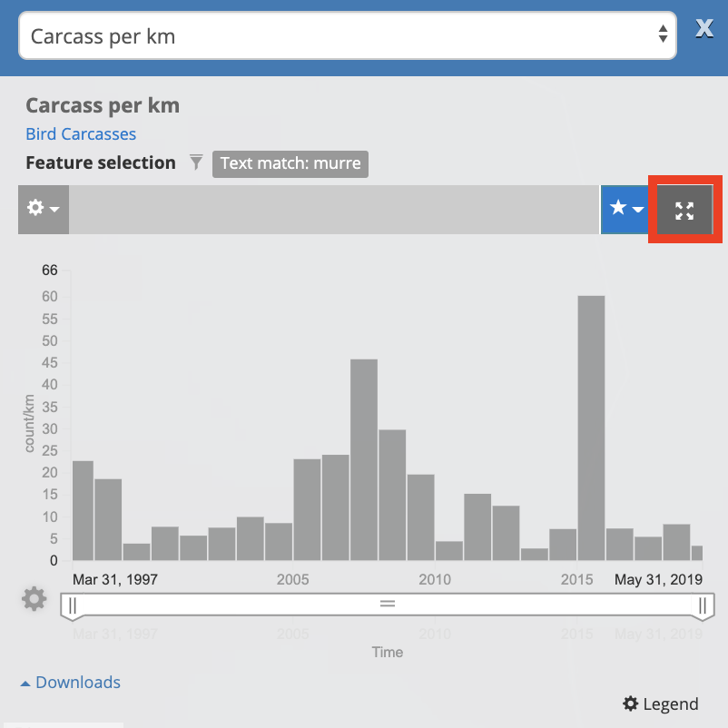
Lets expand this plot by clicking on the Expand icon (see the red box above)
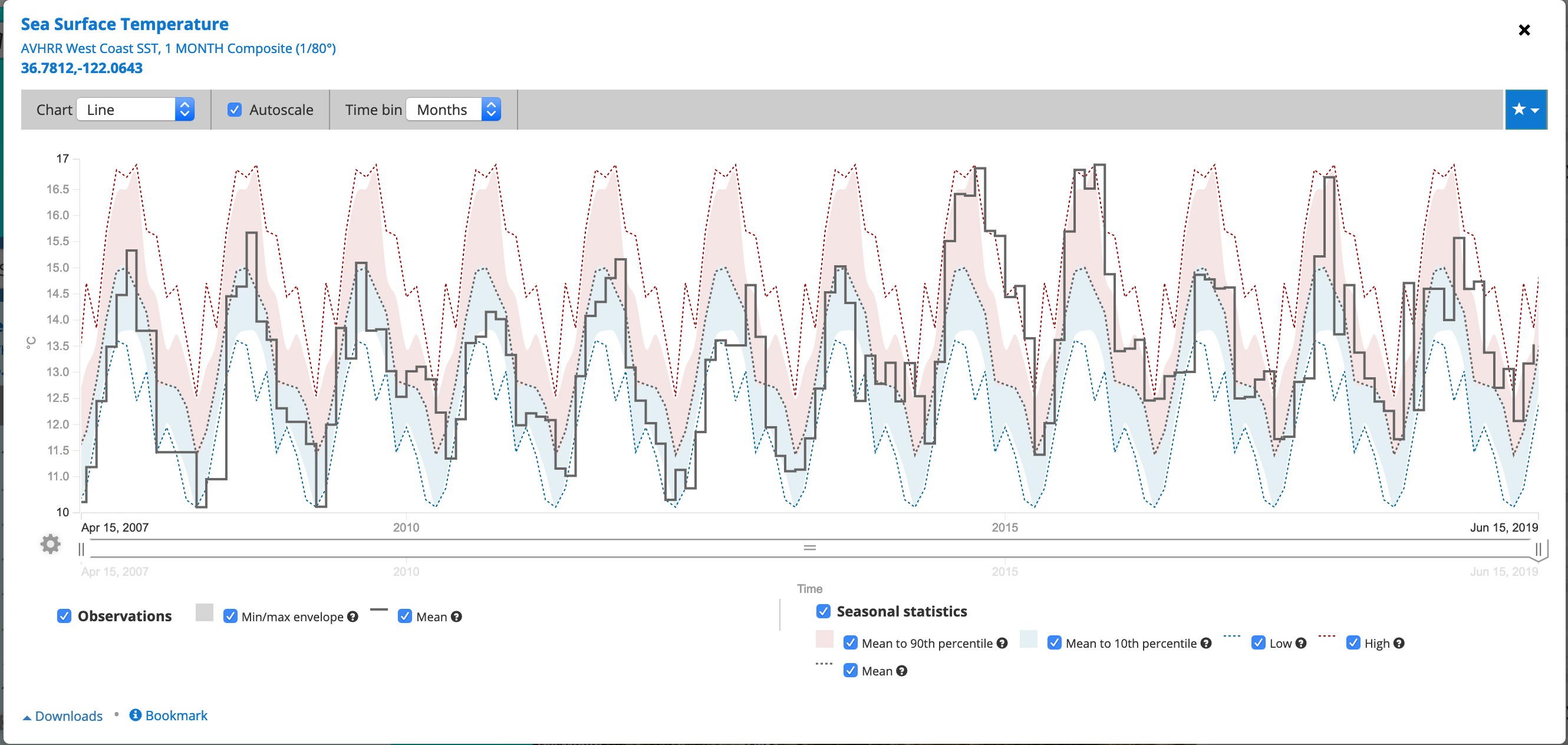
Now we can change how the data are binned through time. By default this dataset is binned into annual values, but we can also display the data for each month (the raw values) or by the season.
Click on the Time Bin pull down and select Months
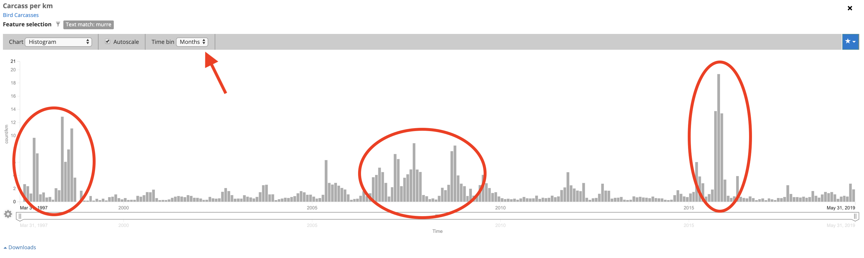
Adding
From this plot a couple of things stand out:
- There is a seasonal signal to Seabird Deposition - Fall and Summer tend to have higher deposition than Winter and Spring
- There are three unusual events that stand out
- 1997: El Nino year, HABS, and Gill Net mortalities
- 2007: Starvation event
- 2015: The Blob: Marine Heatwave
Adding/Comparing Sea Surface Temperature
Let's add the SST layer as measured from Satellites.
This can be found by searching the Data Catalog as shown earlier, but the data catalog can be easily accessed by
selecting the Find Data next to the Legend in the Map Layer.
Now lets search for "SST Monthly" and add the AVHRR West Coast SST, 1 MONTH Composite layer by selecting the blue cross next to the name.
Now lets create a time series of SST in the middle of Monterey Bay. This is done by creating a virtual sensor, a tool that extracts a time series at a single point out of a spatial dataset. This make take a second to load. Link
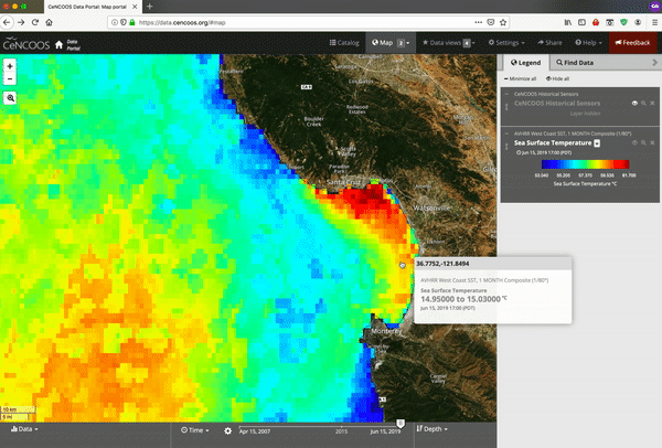
Once its loaded, try to see if you can expand the plot of change around temporal binning.
Tip: The portal has a ton of features and data. Feel free to poke around and try to break things!
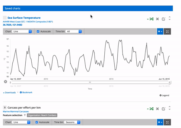
TOPIC: Comparing Data with Data Views
Now we can create a Data View to view multiple types of data on the same page. The first data view will compare two beaches.
Use the polygon to select the Common Murres in Monterey Bay
With the time series open for the beach, Select the counts per effort per km
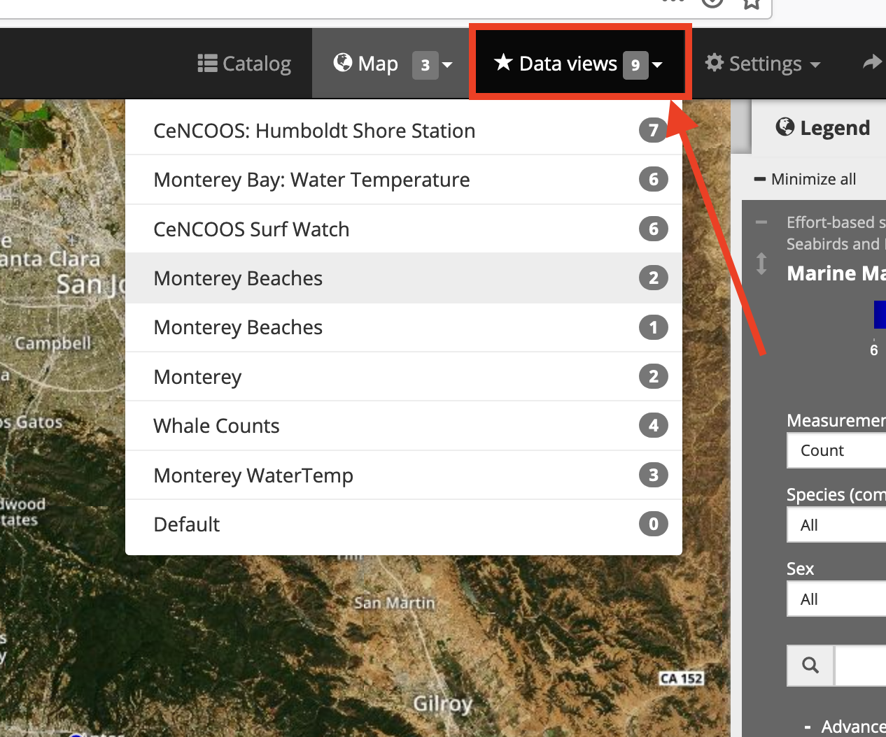
Create a new Data View by selecting the Blue Star button. Then select the Plus sign to create a new data view. Give it a name.
Then a check the two boxes to Save to data view and Add to compare chart
- Now add SST time series to the
Monterey BeachesData view you just learned how to create from the middle of Monterey Bay
- Finally lets look at the Data View! This is done by selecting the Data View button near the top of the portal and selecting the the data view you just created from the drop down menu.
The Data View
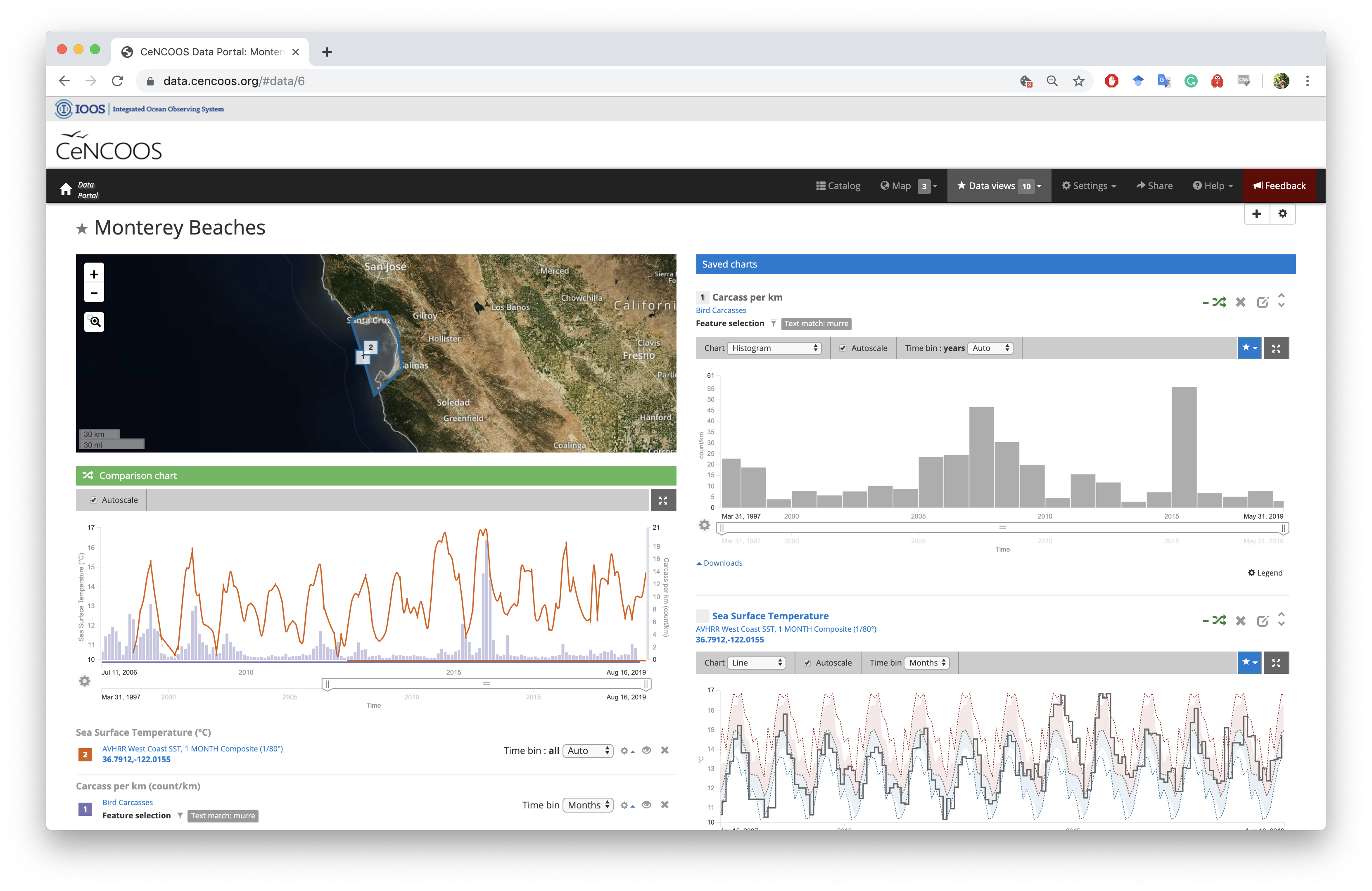
There is a lot of information here, but what stands out (to me at least) is that the increases in mortality are seen at both beaches in 2009 and again in 2015.
Now lets add some SST data
Now the mortality following the Blob really stands out, as well as the seasonality of caracass deposition
Here we can see just how warm the winter months of in 2014. We can also visualize SST as an anomaly or climatology (these are really pseudo-climatologies)
Finally: The Feedback Button
If you are having any trouble, something doesn't look right, or really anything else. Please use the feedback button in the top right of the portal. This button will send us a link to what you are looking at and help us figure out what is going on. It's also a great way for us to log suggestions, so if there is something you would like to see, we want to hear it!
Also, please feel free to reach out to me (Patrick Daniel) at pdaniel@mbari.org if you have questions or need help accessing any of the data.
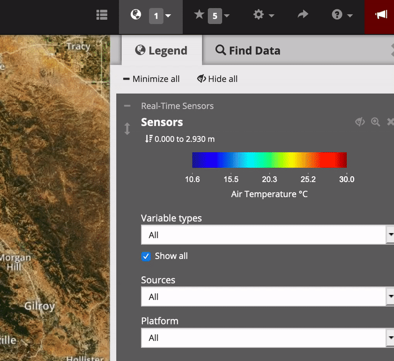
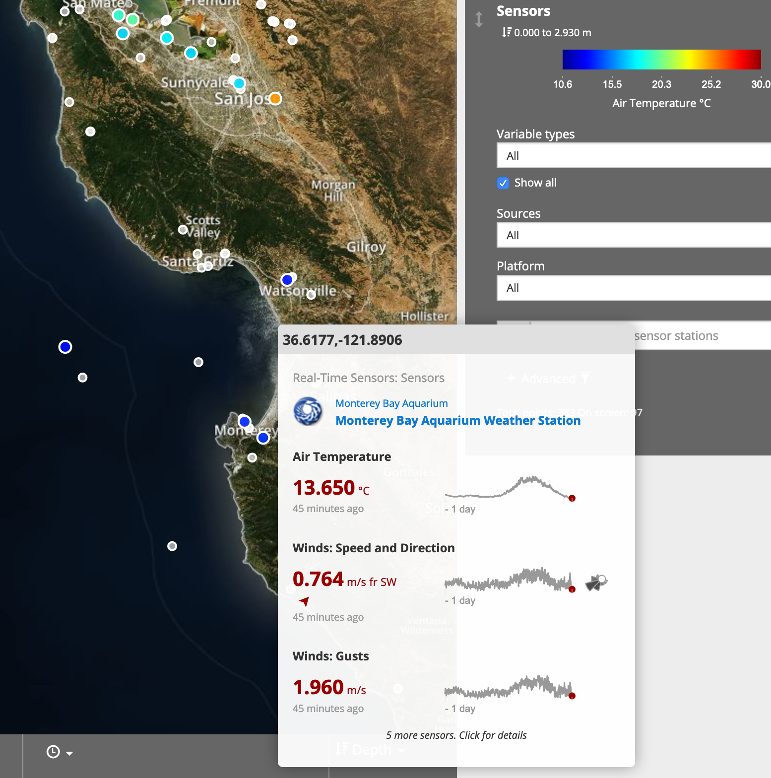
Appendix: Using the Real-time Sensor Layer
The colors that you see on the map correspond to a different parameter being measured at a given location. By default we are seeing Air Temperature and the color corresponds to the most recent value (gray if no values have reported in 24 hours.
Hovering over a circle will give us more information about the data stream and show some recent data.
The portal has multiple ways to filter data: by time, by taxonomy, by collection group and more.
In the Legend box select plus sign on the Advanced Icon. This will expand the filtering options.
Now lets select BeachCOMBERS from the the Organization Drop down Menu.
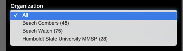
Now if you zoom out on the map you will notice that it is only showing data collected by BeachCOMBERS.